top of page


IKCO

Our team was commissioned to execute the renovation of IKCO 1038, an Authorised Auto Retailer and Service Centre for Iran’s leading automotive manufacturer, Iran Khodro. This project involved a comprehensive redesign of the sales offices and service facilities, including the mechanical garage and body shop, to ensure alignment with Iran Khodro’s corporate identity and branding standards. Our methodology emphasized the enhancement of both functionality and aesthetic coherence, thereby creating an environment that embodies the brand’s professionalism and commitment to customer service.

Overcoming Design Challenges
The project presented several key challenges, including limited office space, restrictions on material selection and design flexibility, as well as the low ceiling height, originally structured as a two-story space. Despite these constraints, we successfully developed a functional and visually appealing design adhering to IKCO's corporate identity and organisational standards. Our approach maximised the efficient use of space, creating a cohesive and professional environment that meets both operational and aesthetic objectives.

Modern Executive Office Design with Strategic Functionality
The redesign of the executive office area demonstrates a seamless integration of modern aesthetics with practical functionality, tailored to meet the managerial and operational requirements of the organisation. Despite spatial constraints, the layout is optimised to include distinct zones for a private meeting area, a welcoming reception, and a centralised executive desk.

Horizontal paneling accented with IKCO’s signature blue reinforces corporate identity while creating a clean, professional atmosphere.
Carefully selected furnishings prioritise comfort and productivity, while maintaining a sleek and contemporary design language.
Carefully selected furnishings prioritise comfort and productivity, while maintaining a sleek and contemporary design language.

The design of the paint shop and service area at IKCO 1038 emphasised functionality while embodying the visual essence of the Iran Khodro brand. Drawing inspiration from industrial aesthetics, the space incorporates a palette of materials that balance robustness and refinement. The use of exposed brick and metallic grey panels provides a professional and contemporary backdrop, while the polished concrete flooring ensures durability and easy maintenance, ideal for high-traffic areas.
Brand identity plays a vital role in the space, with IKCO’s signature blue strategically integrated into feature walls. This not only reinforces the corporate identity but also adds depth and vibrancy to the environment.

The layout for the Iran Khodro 1038 Service and Sales Centre renovation includes carefully designed spaces tailored for functionality and alignment with corporate identity standards.
Designed to provide a welcoming and professional environment for customers, ensuring comfort and accessibility.
Storage Spaces Allocated to support operational needs without encroaching on customer-facing areas.
Manager's Office, Positioned for privacy and efficient workflow.
Kitchen Facilities for staff use, enhancing workplace satisfaction.
The design maintains a balance between aesthetic appeal and practicality, meeting Iran Khodro’s branding requirements while optimising the available space, including overcoming challenges of low ceilings and compact dimensions.
Our team was commissioned to execute the renovation of IKCO 1038, an Authorised Auto Retailer and Service Centre for Iran’s leading automotive manufacturer, Iran Khodro. This project involved a comprehensive redesign of the sales offices and service facilities, including the mechanical garage and body shop, to ensure alignment with Iran Khodro’s corporate identity and branding standards. Our methodology emphasized the enhancement of both functionality and aesthetic coherence, thereby creating an environment that embodies the brand’s professionalism and commitment to customer service.
Overcoming Design Challenges
The project presented several key challenges, including limited office space, restrictions on material selection and design flexibility, as well as the low ceiling height, originally structured as a two-story space. Despite these constraints, we successfully developed a functional and visually appealing design adhering to IKCO's corporate identity and organisational standards. Our approach maximised the efficient use of space, creating a cohesive and professional environment that meets both operational and aesthetic objectives.
Modern Executive Office Design with Strategic Functionality
The redesign of the executive office area demonstrates a seamless integration of modern aesthetics with practical functionality, tailored to meet the managerial and operational requirements of the organisation. Despite spatial constraints, the layout is optimised to include distinct zones for a private meeting area, a welcoming reception, and a centralised executive desk.
Horizontal paneling accented with IKCO’s signature blue reinforces corporate identity while creating a clean, professional atmosphere.
Carefully selected furnishings prioritise comfort and productivity, while maintaining a sleek and contemporary design language.
Carefully selected furnishings prioritise comfort and productivity, while maintaining a sleek and contemporary design language.
The design of the paint shop and service area at IKCO 1038 emphasised functionality while embodying the visual essence of the Iran Khodro brand. Drawing inspiration from industrial aesthetics, the space incorporates a palette of materials that balance robustness and refinement. The use of exposed brick and metallic grey panels provides a professional and contemporary backdrop, while the polished concrete flooring ensures durability and easy maintenance, ideal for high-traffic areas.
Brand identity plays a vital role in the space, with IKCO’s signature blue strategically integrated into feature walls. This not only reinforces the corporate identity but also adds depth and vibrancy to the environment.
The layout for the Iran Khodro 1038 Service and Sales Centre renovation includes carefully designed spaces tailored for functionality and alignment with corporate identity standards.
Designed to provide a welcoming and professional environment for customers, ensuring comfort and accessibility.
Storage Spaces Allocated to support operational needs without encroaching on customer-facing areas.
Manager's Office, Positioned for privacy and efficient workflow.
Kitchen Facilities for staff use, enhancing workplace satisfaction.
The design maintains a balance between aesthetic appeal and practicality, meeting Iran Khodro’s branding requirements while optimising the available space, including overcoming challenges of low ceilings and compact dimensions.
Designed to provide a welcoming and professional environment for customers, ensuring comfort and accessibility.
Storage Spaces Allocated to support operational needs without encroaching on customer-facing areas.
Manager's Office, Positioned for privacy and efficient workflow.
Kitchen Facilities for staff use, enhancing workplace satisfaction.
The design maintains a balance between aesthetic appeal and practicality, meeting Iran Khodro’s branding requirements while optimising the available space, including overcoming challenges of low ceilings and compact dimensions.
1/6
IKCO 1038 - Authorised Auto Retailer & Service Centre
Paprica

Facade and Front Sign
The restaurant’s location adjacent to Tehran’s iconic Bowling Abdu, one of the city’s oldest cultural and sports complexes established in the 1960s, presented a unique design opportunity to connect with visitors' sense of nostalgia. Once a bustling hub, Bowling Abdu has witnessed the emergence of newer, more modern venues over time, yet it retains a special place in the hearts of many, cherished for the memories it holds. Known for its extensive facilities—including a cinema, gym, swimming pool, restaurant complex, billiards hall, sports arenas, and an array of children’s games—Bowling Abdu remains a beloved destination across generations. Recognising this significance, we drew design inspiration from elements that resonate with both children and adults.

Welcoming ambience
The wood paneling not only adds a welcoming warmth to the space but also beautifully contrasts with the sleek modern black walls, enhancing the overall aesthetic appeal.

Design Concept
The design concept for this restaurant draws from the imaginative worlds of Shel Silverstein’s whimsical illustrations and the animated series Simon in the Land of Chalk Drawings, creating a space that appeals to both children and their parents—especially those familiar with Simon, as many are also customers of the neighbouring game centre. This approach allows us to engage both audiences, combining nostalgia for parents with a playful, creative environment for children.


The ceiling design draws the eye upwards, adding a sense of height and depth, while the deep red accents bring a lively energy to the space. The seating arrangement offers comfort and style, making it ideal for families and groups. With the black wall serving as a canvas, the interior transforms into a dynamic backdrop, changing with the time of day and the lively colours of patrons’ attire.

The facade design for Paprica employs a blend of modern aesthetics and branding ingenuity. To establish a distinctive identity, we opted to spell 'Paprica' with a 'C' rather than the traditional 'K,' using the 'C' shape as a key element in the logotype. This decision not only enhances brand recognition but also adds a playful visual element to the exterior.
The facade features a combination of natural wood panels and sleek concrete, bringing a warm yet contemporary feel that draws attention. Floor-to-ceiling spider glass panels create a transparent envelope, allowing passersby a full view of the vibrant interior. This clear glass frontage provides a sense of openness, creating a dynamic visual interaction between the inside and outside, especially with the black interior background that serves as a canvas for the lively activities within. The open facade also invites natural light into the space, creating an inviting atmosphere both day and night. Strategically placed signage and lighting enhance visibility, ensuring the space stands out as a modern, welcoming destination in the heart of the city.
The facade features a combination of natural wood panels and sleek concrete, bringing a warm yet contemporary feel that draws attention. Floor-to-ceiling spider glass panels create a transparent envelope, allowing passersby a full view of the vibrant interior. This clear glass frontage provides a sense of openness, creating a dynamic visual interaction between the inside and outside, especially with the black interior background that serves as a canvas for the lively activities within. The open facade also invites natural light into the space, creating an inviting atmosphere both day and night. Strategically placed signage and lighting enhance visibility, ensuring the space stands out as a modern, welcoming destination in the heart of the city.

With Gratitude to Shel Silverstein and Edward R. McLachlan for Inspiring Artistic Vision
Shel Silverstein (1930-1999)
Edward Rolland McLachlan (1940–2024)
Edward Rolland McLachlan (1940–2024)
Facade and Front Sign
The restaurant’s location adjacent to Tehran’s iconic Bowling Abdu, one of the city’s oldest cultural and sports complexes established in the 1960s, presented a unique design opportunity to connect with visitors' sense of nostalgia. Once a bustling hub, Bowling Abdu has witnessed the emergence of newer, more modern venues over time, yet it retains a special place in the hearts of many, cherished for the memories it holds. Known for its extensive facilities—including a cinema, gym, swimming pool, restaurant complex, billiards hall, sports arenas, and an array of children’s games—Bowling Abdu remains a beloved destination across generations. Recognising this significance, we drew design inspiration from elements that resonate with both children and adults.
Welcoming ambience
The wood paneling not only adds a welcoming warmth to the space but also beautifully contrasts with the sleek modern black walls, enhancing the overall aesthetic appeal.
Design Concept
The design concept for this restaurant draws from the imaginative worlds of Shel Silverstein’s whimsical illustrations and the animated series Simon in the Land of Chalk Drawings, creating a space that appeals to both children and their parents—especially those familiar with Simon, as many are also customers of the neighbouring game centre. This approach allows us to engage both audiences, combining nostalgia for parents with a playful, creative environment for children.
The ceiling design draws the eye upwards, adding a sense of height and depth, while the deep red accents bring a lively energy to the space. The seating arrangement offers comfort and style, making it ideal for families and groups. With the black wall serving as a canvas, the interior transforms into a dynamic backdrop, changing with the time of day and the lively colours of patrons’ attire.
The facade design for Paprica employs a blend of modern aesthetics and branding ingenuity. To establish a distinctive identity, we opted to spell 'Paprica' with a 'C' rather than the traditional 'K,' using the 'C' shape as a key element in the logotype. This decision not only enhances brand recognition but also adds a playful visual element to the exterior.
The facade features a combination of natural wood panels and sleek concrete, bringing a warm yet contemporary feel that draws attention. Floor-to-ceiling spider glass panels create a transparent envelope, allowing passersby a full view of the vibrant interior. This clear glass frontage provides a sense of openness, creating a dynamic visual interaction between the inside and outside, especially with the black interior background that serves as a canvas for the lively activities within. The open facade also invites natural light into the space, creating an inviting atmosphere both day and night. Strategically placed signage and lighting enhance visibility, ensuring the space stands out as a modern, welcoming destination in the heart of the city.
The facade features a combination of natural wood panels and sleek concrete, bringing a warm yet contemporary feel that draws attention. Floor-to-ceiling spider glass panels create a transparent envelope, allowing passersby a full view of the vibrant interior. This clear glass frontage provides a sense of openness, creating a dynamic visual interaction between the inside and outside, especially with the black interior background that serves as a canvas for the lively activities within. The open facade also invites natural light into the space, creating an inviting atmosphere both day and night. Strategically placed signage and lighting enhance visibility, ensuring the space stands out as a modern, welcoming destination in the heart of the city.
With Gratitude to Shel Silverstein and Edward R. McLachlan for Inspiring Artistic Vision
Shel Silverstein (1930-1999)
Edward Rolland McLachlan (1940–2024)
Edward Rolland McLachlan (1940–2024)
1/7
Kesari Kebab

The facade blends modern sophistication with traditional warmth. Dark brickwork establishes a bold identity, while vertical timber slats soften the exterior, creating an inviting contrast. Carefully integrated metal signage enhances the restaurant’s branding, while warm-toned lighting highlights key architectural details. The entrance feels welcoming and distinctive, drawing patrons inside.

Main Dining Area with Layered Ceiling Design
Our team was appointed to design Kesari Kebab Restaurant, an upscale Indian dining establishment. The design brief focused on offering diverse seating arrangements, ranging from open communal areas to more intimate private spaces, with the flexibility to adapt for larger events and special occasions.
This project reflects our commitment to blending cultural authenticity with contemporary design principles, delivering a space that is both visually captivating and functionally adaptable to meet the evolving needs of the client and their patrons.
The proposed ground floor plan for Kesari Kebab Restaurant is designed to prioritise both versatility and luxury. The layout incorporates various seating arrangements, ranging from open communal areas to subdivided private spaces, catering to a diverse clientele and dining experiences. Each seating zone is crafted to provide comfort and exclusivity, ensuring a premium experience for guests.
The private areas are strategically designed to maintain intimacy while allowing for adaptability. The layout is modular, enabling the reconfiguration of spaces to host larger gatherings or events without disrupting the overall flow. This flexibility ensures that the restaurant can seamlessly transition between regular operations and special occasions.
Central to the design is an efficient circulation path, ensuring smooth movement for staff and patrons while maximising the use of available space. Additionally, the integration of ambient lighting and careful placement of decorative elements further enhances the luxurious yet welcoming atmosphere of the restaurant.

Bar and Dining Transition Space
The design integrates a striking combination of warm materials and contemporary elements. The illuminated onyx bar counter serves as a focal point, adding a luxurious ambiance while enhancing the richness of the space.
The bar area exudes character, seamlessly integrating the restaurant’s branding into its design. The Kesari Kebab insignia sits proudly above the fluted timber bar, where a textured dark backdrop provides a striking contrast. Concealed LED strips and ambient pendant lights create a warm, inviting glow, ensuring the space remains both functional and visually appealing.
The bar area exudes character, seamlessly integrating the restaurant’s branding into its design. The Kesari Kebab insignia sits proudly above the fluted timber bar, where a textured dark backdrop provides a striking contrast. Concealed LED strips and ambient pendant lights create a warm, inviting glow, ensuring the space remains both functional and visually appealing.

The design integrates elements such as modular layouts, ambient lighting, and culturally inspired decorative accents to create a sophisticated yet welcoming atmosphere.

A key feature of the main dining space is the dynamic ceiling treatment, composed of undulating wooden slats that add rhythm and movement, creating a visually engaging canopy above diners. This organic flow is complemented by suspended lighting elements, enhancing the spatial depth and warmth. The overall material palette, consisting of tactile wood surfaces, fabric-upholstered seating, and earthy tones, ensures a harmonious and immersive dining experience. The modular furniture arrangement allows flexibility in accommodating different group sizes, reinforcing the adaptability of the space.

The undulating timber ceiling adds movement and depth, drawing the eye upward while softening acoustics to enhance comfort. A row of suspended acrylic panels diffuses light, introducing a delicate glow that complements the rich wood tones.
Carefully curated seating arrangements combine plush upholstered banquettes with sculptural chairs, ensuring both style and ergonomic support. The natural wood tabletops add warmth, harmonizing with the earthy palette of the space. Decorative wall panels with a rhythmic vertical pattern introduce depth, while metallic sculptural accents reflect ambient lighting, adding a dynamic visual element.
Carefully curated seating arrangements combine plush upholstered banquettes with sculptural chairs, ensuring both style and ergonomic support. The natural wood tabletops add warmth, harmonizing with the earthy palette of the space. Decorative wall panels with a rhythmic vertical pattern introduce depth, while metallic sculptural accents reflect ambient lighting, adding a dynamic visual element.

Above, a suspended panel system featuring staggered acrylic baffles creates an eye-catching ceiling detail that subtly diffuses light, adding texture and depth. Pendant lights with organic shapes complement the overall aesthetic, reinforcing the theme of cultural warmth and elegance. The open seating arrangement promotes a social dining experience while maintaining a sense of refined exclusivity.

The spatial zoning within this area of Kesari Kebab Restaurant carefully balances open and private dining experiences. The left side of the space remains open and dynamic, featuring lighter, movable furniture arrangements that encourage social interaction and fluid movement. In contrast, the right side transitions into a more intimate dining setting with plush, high-backed seating that offers guests a sense of privacy without full enclosure.
A dining space that seamlessly balances intimacy and openness, offering diners a refined yet relaxed experience in an environment designed for both aesthetics and functionality.
The ceiling’s organic swirls contrast with the geometric partition, which subtly separates the dining area without fully enclosing it, preserving a sense of openness. This interplay between fluid and structured elements reflects the restaurant’s balance of tradition and modernity.

Framing the Dining Space
The layout draws guests into an immersive dining experience, framed by varying ceiling heights and textured materials. A bold feature artwork anchors the space, introducing color and movement against the exposed brick wall. Carefully curated lighting enhances depth and atmosphere, ensuring the space remains inviting and dynamic.
Geometric partition panels create semi-private dining spaces, allowing guests to enjoy intimacy without feeling enclosed. The sculptural ceiling design introduces depth and visual intrigue, referencing traditional Indian motifs in a contemporary way. Soft green upholstery, textured wood, and carefully positioned lighting enhance comfort, making the space feel both intimate and sophisticated.
Geometric partition panels create semi-private dining spaces, allowing guests to enjoy intimacy without feeling enclosed. The sculptural ceiling design introduces depth and visual intrigue, referencing traditional Indian motifs in a contemporary way. Soft green upholstery, textured wood, and carefully positioned lighting enhance comfort, making the space feel both intimate and sophisticated.

The illuminated onyx bar counter instantly captures attention, adding warmth and elegance while serving as a central gathering point. Above, suspended acrylic baffles create a dynamic ceiling feature, diffusing light and adding texture to the space. Pendant lights in organic shapes complement the natural elements, reinforcing a sense of authenticity. The open dining arrangement fosters social engagement while maintaining a refined ambiance.

The project aimed to create a luxurious and versatile environment that seamlessly combines cultural heritage with modern functionality.
The materiality plays a crucial role in defining zones—warm timber, textured metal panels, and intricate wall reliefs create a tactile journey that enhances the dining experience. The transition between the more open seating and the enveloping booths reflects the restaurant’s commitment to versatility, catering to both intimate gatherings and larger social engagements.
The materiality plays a crucial role in defining zones—warm timber, textured metal panels, and intricate wall reliefs create a tactile journey that enhances the dining experience. The transition between the more open seating and the enveloping booths reflects the restaurant’s commitment to versatility, catering to both intimate gatherings and larger social engagements.

The layout prioritised efficient space utilisation while ensuring comfort and exclusivity for diners.
The transition between the more open seating and the enveloping booths reflects the restaurant’s commitment to versatility, catering to both intimate gatherings and larger social engagements.
The transition between the more open seating and the enveloping booths reflects the restaurant’s commitment to versatility, catering to both intimate gatherings and larger social engagements.

The proposed Ground Floor Reflected Ceiling Plan (RCP) for Kesari Kebab Restaurant highlights a meticulously designed ceiling layout that complements the overall aesthetic and functionality of the space. Key features include:
Ambient and Task Lighting: Strategically placed recessed and pendant lighting ensure a balanced illumination across various dining areas, creating an inviting and luxurious atmosphere while also catering to the functional needs of staff and patrons.
Zonal Differentiation: The ceiling design subtly reinforces the division of spaces within the restaurant, such as communal seating, private dining areas, and event spaces, through the use of varying lighting intensities and fixtures.
Integrated HVAC and Utility Systems: The plan accommodates concealed HVAC ducts and utility installations to maintain a clean and uncluttered visual appeal, aligning with the modern and sophisticated design ethos of the restaurant.
Decorative Accents: Selective use of ornamental ceiling features adds depth and character, resonating with the cultural elements of the restaurant’s Indian theme while maintaining a contemporary look.

Materials were chosen with both durability and aesthetic appeal in mind. Timber cladding on walls and ceilings introduces warmth and a sense of handcrafted authenticity, reflecting the restaurant’s Indian heritage. This is complemented by sleek stone finishes and polished concrete flooring, which provide a modern contrast. The intentional juxtaposition of these materials enhances the overall spatial narrative, combining tradition with modernity.
Differentiated ceiling heights across various zones provide a sense of openness in communal areas and intimacy in private dining spaces, creating a dynamic spatial experience.
The vertical alignment of recessed and pendant lighting fixtures is carefully planned to accentuate the interior decor while offering adequate illumination for each functional area.
Layers of materials, including textured wall finishes and decorative ceiling features, add depth and character to the interior, subtly reflecting the cultural theme of the restaurant.
The sections showcase the adaptability of the design, accommodating modular furniture and partitions for private dining or larger gatherings without compromising the flow and functionality.

The proposed facade design for Kesari Kebab Restaurant embraces a contemporary aesthetic while maintaining cultural elements relevant to its Indian roots. The exterior features a balanced use of materials and textures, creating a welcoming yet sophisticated visual appeal. The design integrates large glass panels to maximise natural light and provide visibility into the restaurant, establishing a connection between the interior ambience and the exterior environment.
The facade integrates glass panels framed with metal accents, allowing transparency and visibility from the exterior. This open visual connection invites passersby while maintaining the interior’s cohesive aesthetic. The facade is structured to provide a dynamic play of light and shadow, which adds depth to its visual presence. Ornamental detailing subtly hints at Indian motifs, ensuring the cultural context is represented without overwhelming the modern design elements. This balance reflects the dual objective of creating a luxurious dining experience while accommodating flexibility for private dining or larger events.
The use of adaptable materials ensures durability and ease of maintenance, aligning with the practical needs of a high-traffic restaurant space. Additionally, the modular design allows for future modifications to accommodate any operational changes or branding updates seamlessly.

The facade blends modern sophistication with traditional warmth. Dark brickwork establishes a bold identity, while vertical timber slats soften the exterior, creating an inviting contrast. Carefully integrated metal signage enhances the restaurant’s branding, while warm-toned lighting highlights key architectural details. The entrance feels welcoming and distinctive, drawing patrons inside.
Main Dining Area with Layered Ceiling Design
Our team was appointed to design Kesari Kebab Restaurant, an upscale Indian dining establishment. The design brief focused on offering diverse seating arrangements, ranging from open communal areas to more intimate private spaces, with the flexibility to adapt for larger events and special occasions.
This project reflects our commitment to blending cultural authenticity with contemporary design principles, delivering a space that is both visually captivating and functionally adaptable to meet the evolving needs of the client and their patrons.
The proposed ground floor plan for Kesari Kebab Restaurant is designed to prioritise both versatility and luxury. The layout incorporates various seating arrangements, ranging from open communal areas to subdivided private spaces, catering to a diverse clientele and dining experiences. Each seating zone is crafted to provide comfort and exclusivity, ensuring a premium experience for guests.
The private areas are strategically designed to maintain intimacy while allowing for adaptability. The layout is modular, enabling the reconfiguration of spaces to host larger gatherings or events without disrupting the overall flow. This flexibility ensures that the restaurant can seamlessly transition between regular operations and special occasions.
Central to the design is an efficient circulation path, ensuring smooth movement for staff and patrons while maximising the use of available space. Additionally, the integration of ambient lighting and careful placement of decorative elements further enhances the luxurious yet welcoming atmosphere of the restaurant.
This project reflects our commitment to blending cultural authenticity with contemporary design principles, delivering a space that is both visually captivating and functionally adaptable to meet the evolving needs of the client and their patrons.
The proposed ground floor plan for Kesari Kebab Restaurant is designed to prioritise both versatility and luxury. The layout incorporates various seating arrangements, ranging from open communal areas to subdivided private spaces, catering to a diverse clientele and dining experiences. Each seating zone is crafted to provide comfort and exclusivity, ensuring a premium experience for guests.
The private areas are strategically designed to maintain intimacy while allowing for adaptability. The layout is modular, enabling the reconfiguration of spaces to host larger gatherings or events without disrupting the overall flow. This flexibility ensures that the restaurant can seamlessly transition between regular operations and special occasions.
Central to the design is an efficient circulation path, ensuring smooth movement for staff and patrons while maximising the use of available space. Additionally, the integration of ambient lighting and careful placement of decorative elements further enhances the luxurious yet welcoming atmosphere of the restaurant.
Bar and Dining Transition Space
The design integrates a striking combination of warm materials and contemporary elements. The illuminated onyx bar counter serves as a focal point, adding a luxurious ambiance while enhancing the richness of the space.
The bar area exudes character, seamlessly integrating the restaurant’s branding into its design. The Kesari Kebab insignia sits proudly above the fluted timber bar, where a textured dark backdrop provides a striking contrast. Concealed LED strips and ambient pendant lights create a warm, inviting glow, ensuring the space remains both functional and visually appealing.
The bar area exudes character, seamlessly integrating the restaurant’s branding into its design. The Kesari Kebab insignia sits proudly above the fluted timber bar, where a textured dark backdrop provides a striking contrast. Concealed LED strips and ambient pendant lights create a warm, inviting glow, ensuring the space remains both functional and visually appealing.
The design integrates elements such as modular layouts, ambient lighting, and culturally inspired decorative accents to create a sophisticated yet welcoming atmosphere.
A key feature of the main dining space is the dynamic ceiling treatment, composed of undulating wooden slats that add rhythm and movement, creating a visually engaging canopy above diners. This organic flow is complemented by suspended lighting elements, enhancing the spatial depth and warmth. The overall material palette, consisting of tactile wood surfaces, fabric-upholstered seating, and earthy tones, ensures a harmonious and immersive dining experience. The modular furniture arrangement allows flexibility in accommodating different group sizes, reinforcing the adaptability of the space.
The undulating timber ceiling adds movement and depth, drawing the eye upward while softening acoustics to enhance comfort. A row of suspended acrylic panels diffuses light, introducing a delicate glow that complements the rich wood tones.
Carefully curated seating arrangements combine plush upholstered banquettes with sculptural chairs, ensuring both style and ergonomic support. The natural wood tabletops add warmth, harmonizing with the earthy palette of the space. Decorative wall panels with a rhythmic vertical pattern introduce depth, while metallic sculptural accents reflect ambient lighting, adding a dynamic visual element.
Carefully curated seating arrangements combine plush upholstered banquettes with sculptural chairs, ensuring both style and ergonomic support. The natural wood tabletops add warmth, harmonizing with the earthy palette of the space. Decorative wall panels with a rhythmic vertical pattern introduce depth, while metallic sculptural accents reflect ambient lighting, adding a dynamic visual element.
Above, a suspended panel system featuring staggered acrylic baffles creates an eye-catching ceiling detail that subtly diffuses light, adding texture and depth. Pendant lights with organic shapes complement the overall aesthetic, reinforcing the theme of cultural warmth and elegance. The open seating arrangement promotes a social dining experience while maintaining a sense of refined exclusivity.
The spatial zoning within this area of Kesari Kebab Restaurant carefully balances open and private dining experiences. The left side of the space remains open and dynamic, featuring lighter, movable furniture arrangements that encourage social interaction and fluid movement. In contrast, the right side transitions into a more intimate dining setting with plush, high-backed seating that offers guests a sense of privacy without full enclosure.
A dining space that seamlessly balances intimacy and openness, offering diners a refined yet relaxed experience in an environment designed for both aesthetics and functionality.
The ceiling’s organic swirls contrast with the geometric partition, which subtly separates the dining area without fully enclosing it, preserving a sense of openness. This interplay between fluid and structured elements reflects the restaurant’s balance of tradition and modernity.
A dining space that seamlessly balances intimacy and openness, offering diners a refined yet relaxed experience in an environment designed for both aesthetics and functionality.
The ceiling’s organic swirls contrast with the geometric partition, which subtly separates the dining area without fully enclosing it, preserving a sense of openness. This interplay between fluid and structured elements reflects the restaurant’s balance of tradition and modernity.
Framing the Dining Space
The layout draws guests into an immersive dining experience, framed by varying ceiling heights and textured materials. A bold feature artwork anchors the space, introducing color and movement against the exposed brick wall. Carefully curated lighting enhances depth and atmosphere, ensuring the space remains inviting and dynamic.
Geometric partition panels create semi-private dining spaces, allowing guests to enjoy intimacy without feeling enclosed. The sculptural ceiling design introduces depth and visual intrigue, referencing traditional Indian motifs in a contemporary way. Soft green upholstery, textured wood, and carefully positioned lighting enhance comfort, making the space feel both intimate and sophisticated.
Geometric partition panels create semi-private dining spaces, allowing guests to enjoy intimacy without feeling enclosed. The sculptural ceiling design introduces depth and visual intrigue, referencing traditional Indian motifs in a contemporary way. Soft green upholstery, textured wood, and carefully positioned lighting enhance comfort, making the space feel both intimate and sophisticated.
The illuminated onyx bar counter instantly captures attention, adding warmth and elegance while serving as a central gathering point. Above, suspended acrylic baffles create a dynamic ceiling feature, diffusing light and adding texture to the space. Pendant lights in organic shapes complement the natural elements, reinforcing a sense of authenticity. The open dining arrangement fosters social engagement while maintaining a refined ambiance.
The project aimed to create a luxurious and versatile environment that seamlessly combines cultural heritage with modern functionality.
The materiality plays a crucial role in defining zones—warm timber, textured metal panels, and intricate wall reliefs create a tactile journey that enhances the dining experience. The transition between the more open seating and the enveloping booths reflects the restaurant’s commitment to versatility, catering to both intimate gatherings and larger social engagements.
The materiality plays a crucial role in defining zones—warm timber, textured metal panels, and intricate wall reliefs create a tactile journey that enhances the dining experience. The transition between the more open seating and the enveloping booths reflects the restaurant’s commitment to versatility, catering to both intimate gatherings and larger social engagements.
The layout prioritised efficient space utilisation while ensuring comfort and exclusivity for diners.
The transition between the more open seating and the enveloping booths reflects the restaurant’s commitment to versatility, catering to both intimate gatherings and larger social engagements.
The transition between the more open seating and the enveloping booths reflects the restaurant’s commitment to versatility, catering to both intimate gatherings and larger social engagements.
The proposed Ground Floor Reflected Ceiling Plan (RCP) for Kesari Kebab Restaurant highlights a meticulously designed ceiling layout that complements the overall aesthetic and functionality of the space. Key features include:
Ambient and Task Lighting: Strategically placed recessed and pendant lighting ensure a balanced illumination across various dining areas, creating an inviting and luxurious atmosphere while also catering to the functional needs of staff and patrons.
Zonal Differentiation: The ceiling design subtly reinforces the division of spaces within the restaurant, such as communal seating, private dining areas, and event spaces, through the use of varying lighting intensities and fixtures.
Integrated HVAC and Utility Systems: The plan accommodates concealed HVAC ducts and utility installations to maintain a clean and uncluttered visual appeal, aligning with the modern and sophisticated design ethos of the restaurant.
Decorative Accents: Selective use of ornamental ceiling features adds depth and character, resonating with the cultural elements of the restaurant’s Indian theme while maintaining a contemporary look.
Ambient and Task Lighting: Strategically placed recessed and pendant lighting ensure a balanced illumination across various dining areas, creating an inviting and luxurious atmosphere while also catering to the functional needs of staff and patrons.
Zonal Differentiation: The ceiling design subtly reinforces the division of spaces within the restaurant, such as communal seating, private dining areas, and event spaces, through the use of varying lighting intensities and fixtures.
Integrated HVAC and Utility Systems: The plan accommodates concealed HVAC ducts and utility installations to maintain a clean and uncluttered visual appeal, aligning with the modern and sophisticated design ethos of the restaurant.
Decorative Accents: Selective use of ornamental ceiling features adds depth and character, resonating with the cultural elements of the restaurant’s Indian theme while maintaining a contemporary look.
Materials were chosen with both durability and aesthetic appeal in mind. Timber cladding on walls and ceilings introduces warmth and a sense of handcrafted authenticity, reflecting the restaurant’s Indian heritage. This is complemented by sleek stone finishes and polished concrete flooring, which provide a modern contrast. The intentional juxtaposition of these materials enhances the overall spatial narrative, combining tradition with modernity.
Differentiated ceiling heights across various zones provide a sense of openness in communal areas and intimacy in private dining spaces, creating a dynamic spatial experience.
The vertical alignment of recessed and pendant lighting fixtures is carefully planned to accentuate the interior decor while offering adequate illumination for each functional area.
Layers of materials, including textured wall finishes and decorative ceiling features, add depth and character to the interior, subtly reflecting the cultural theme of the restaurant.
The sections showcase the adaptability of the design, accommodating modular furniture and partitions for private dining or larger gatherings without compromising the flow and functionality.
Differentiated ceiling heights across various zones provide a sense of openness in communal areas and intimacy in private dining spaces, creating a dynamic spatial experience.
The vertical alignment of recessed and pendant lighting fixtures is carefully planned to accentuate the interior decor while offering adequate illumination for each functional area.
Layers of materials, including textured wall finishes and decorative ceiling features, add depth and character to the interior, subtly reflecting the cultural theme of the restaurant.
The sections showcase the adaptability of the design, accommodating modular furniture and partitions for private dining or larger gatherings without compromising the flow and functionality.
The proposed facade design for Kesari Kebab Restaurant embraces a contemporary aesthetic while maintaining cultural elements relevant to its Indian roots. The exterior features a balanced use of materials and textures, creating a welcoming yet sophisticated visual appeal. The design integrates large glass panels to maximise natural light and provide visibility into the restaurant, establishing a connection between the interior ambience and the exterior environment.
The facade integrates glass panels framed with metal accents, allowing transparency and visibility from the exterior. This open visual connection invites passersby while maintaining the interior’s cohesive aesthetic. The facade is structured to provide a dynamic play of light and shadow, which adds depth to its visual presence. Ornamental detailing subtly hints at Indian motifs, ensuring the cultural context is represented without overwhelming the modern design elements. This balance reflects the dual objective of creating a luxurious dining experience while accommodating flexibility for private dining or larger events.
The use of adaptable materials ensures durability and ease of maintenance, aligning with the practical needs of a high-traffic restaurant space. Additionally, the modular design allows for future modifications to accommodate any operational changes or branding updates seamlessly.
The facade integrates glass panels framed with metal accents, allowing transparency and visibility from the exterior. This open visual connection invites passersby while maintaining the interior’s cohesive aesthetic. The facade is structured to provide a dynamic play of light and shadow, which adds depth to its visual presence. Ornamental detailing subtly hints at Indian motifs, ensuring the cultural context is represented without overwhelming the modern design elements. This balance reflects the dual objective of creating a luxurious dining experience while accommodating flexibility for private dining or larger events.
The use of adaptable materials ensures durability and ease of maintenance, aligning with the practical needs of a high-traffic restaurant space. Additionally, the modular design allows for future modifications to accommodate any operational changes or branding updates seamlessly.
1/16
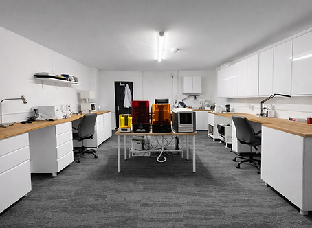
Dental Lab 1

AK Smile Lab 1
AK Smile Lab 1 was conceived as a compact yet highly efficient dental laboratory, designed to support a busy dental clinic on 97 Russell Lane.
Working within a limited footprint, we carefully organised the space to balance precision work with everyday functionality. Dedicated areas for digital design and laboratory processes were seamlessly integrated, ensuring a smooth workflow between clinical needs and technical production.
The result is a small but refined laboratory environment, thoughtfully designed to maximise efficiency, clarity, and performance within a constrained space.
1/5

AK Smile Lab 2
Following the successful delivery of AK Smile Lab 1, we were appointed to design the second branch in 1A Spencer Court Yard, a continuation of a trusted partnership built on the client’s satisfaction with our previous work. Starting with an empty shell, we shaped the space into a fully coordinated dental laboratory, carefully planned around flow, precision, and everyday function. The design brought together reception and administration areas with dedicated zones for digital CAD/CAM design and laboratory operations, creating a workspace that feels both efficient and purposeful. The result is a well-organised laboratory environment, transformed from a blank unit into a space designed to support accuracy, productivity, and growth.
1/7

We were appointed to resolve an existing takeaway unit in Unit 21 Coomercial Road that had become stalled by multiple Building Regulation failures, preventing it from obtaining the approvals needed to proceed.
Through detailed architectural, structural, and fire safety review, we developed a coordinated design response to address the non-compliant elements, from escape routes and structural requirements to access, ventilation, sanitation, and energy performance.
The result was a clear and fully coordinated package that turned a problematic scheme into one ready to meet Building Control requirements and move forward with confidence.
1/10

This project was designed for a client who wanted an independent, शांत and distinctive space for work, focus and personal use within the garden of their home. The presence of an existing lake on the site offered a unique opportunity to create a richer architectural experience, so in our proposed approach, the building was positioned directly alongside the water. Rather than becoming simply a detached workspace, the project was conceived as an integral part of the wider landscape, establishing a direct relationship with the view, natural light, water and surrounding greenery.

The scheme includes a private office, mini golf room, bar/kitchenette, and washroom, and was developed to create a balance between work and leisure. The main concept was to move away from the conventional idea of a purely functional office and instead create a more inspiring, personal and immersive environment, one that would meet the client’s practical needs while also making daily use of nature part of the experience. In this project, work and relaxation are not treated as separate or conflicting functions, but as complementary elements brought together within one coherent architectural response.

Particular attention was given at the planning stage to the relationship between the building and the lake, the access route, the arrival sequence, the spatial hierarchy, and the overall way the user experiences the project. Positioning the building beside the water allowed panoramic views to become one of the defining qualities of the design, while the lake itself was treated not as a decorative backdrop, but as an active part of the architectural identity of the scheme. This decision helped shape a space that offers both privacy and calm, while making full use of the site’s natural assets to elevate the overall quality of the environment.

The design of the plan, massing and circulation was developed with the same level of care. Spaces were organised to accommodate the different functions while maintaining clarity, fluidity and ease of movement throughout the building. The form, defined by soft lines and a carefully considered extension into the natural setting, was designed to sit within the landscape in a controlled and harmonious way. The journey towards the building, movement around it, and the transition between its internal functions were all carefully considered so that occupying the project becomes a gradual and intentional spatial experience.

The site conditions and local climate also played a key role in shaping the design. Solar orientation, natural daylight, prevailing winds, privacy, outlook and the full potential of the surrounding landscape were all important design drivers. Openings, spatial orientation, the relationship between interior and exterior, and the way the building extends into the site were all developed to achieve environmental comfort, strong visual quality and a more intelligent response to the context. As a result, the project is not only visually distinctive, but also functionally aligned with its setting.

Material selection was approached in the same way, with the aim of giving the building a clear architectural identity while maintaining a balanced dialogue with the natural context. Wood, glass and concrete were chosen as the primary materials. Wood introduces warmth and reinforces a natural atmosphere, glass softens the boundary between inside and outside, and concrete provides solidity, durability and a contemporary architectural character. Together, these materials create a controlled contrast with the landscape, yet ultimately work in favour of a stronger connection with the site, a higher spatial quality, and a more refined architectural expression.

The result is a project that goes beyond the idea of a conventional garden office. It reflects our approach to highly individual, site-responsive design, where the client’s brief, the character of the landscape, the quality of spatial experience and the architectural language are all considered together and resolved as a unified whole. More than just a place to work, this building was designed as a setting for focus, calm, interaction and enjoyment of nature.

This project was designed for a client who wanted an independent, शांत and distinctive space for work, focus and personal use within the garden of their home. The presence of an existing lake on the site offered a unique opportunity to create a richer architectural experience, so in our proposed approach, the building was positioned directly alongside the water. Rather than becoming simply a detached workspace, the project was conceived as an integral part of the wider landscape, establishing a direct relationship with the view, natural light, water and surrounding greenery.
The scheme includes a private office, mini golf room, bar/kitchenette, and washroom, and was developed to create a balance between work and leisure. The main concept was to move away from the conventional idea of a purely functional office and instead create a more inspiring, personal and immersive environment, one that would meet the client’s practical needs while also making daily use of nature part of the experience. In this project, work and relaxation are not treated as separate or conflicting functions, but as complementary elements brought together within one coherent architectural response.
Particular attention was given at the planning stage to the relationship between the building and the lake, the access route, the arrival sequence, the spatial hierarchy, and the overall way the user experiences the project. Positioning the building beside the water allowed panoramic views to become one of the defining qualities of the design, while the lake itself was treated not as a decorative backdrop, but as an active part of the architectural identity of the scheme. This decision helped shape a space that offers both privacy and calm, while making full use of the site’s natural assets to elevate the overall quality of the environment.
The design of the plan, massing and circulation was developed with the same level of care. Spaces were organised to accommodate the different functions while maintaining clarity, fluidity and ease of movement throughout the building. The form, defined by soft lines and a carefully considered extension into the natural setting, was designed to sit within the landscape in a controlled and harmonious way. The journey towards the building, movement around it, and the transition between its internal functions were all carefully considered so that occupying the project becomes a gradual and intentional spatial experience.
The site conditions and local climate also played a key role in shaping the design. Solar orientation, natural daylight, prevailing winds, privacy, outlook and the full potential of the surrounding landscape were all important design drivers. Openings, spatial orientation, the relationship between interior and exterior, and the way the building extends into the site were all developed to achieve environmental comfort, strong visual quality and a more intelligent response to the context. As a result, the project is not only visually distinctive, but also functionally aligned with its setting.
Material selection was approached in the same way, with the aim of giving the building a clear architectural identity while maintaining a balanced dialogue with the natural context. Wood, glass and concrete were chosen as the primary materials. Wood introduces warmth and reinforces a natural atmosphere, glass softens the boundary between inside and outside, and concrete provides solidity, durability and a contemporary architectural character. Together, these materials create a controlled contrast with the landscape, yet ultimately work in favour of a stronger connection with the site, a higher spatial quality, and a more refined architectural expression.
The result is a project that goes beyond the idea of a conventional garden office. It reflects our approach to highly individual, site-responsive design, where the client’s brief, the character of the landscape, the quality of spatial experience and the architectural language are all considered together and resolved as a unified whole. More than just a place to work, this building was designed as a setting for focus, calm, interaction and enjoyment of nature.
1/8
bottom of page